The Nokia N1 tablet has been selling like hot cakes in China and Taiwan, selling out in just four minutes when it was first launched back in January. It seems rather odd, then, that Nokia has yet to bring the N1 to the UK. I had a brief glimpse of it at MWC, but there's still no news on when, or if, Nokia will bring it to Europe. Still, for those willing to take the risk of buying one through eBay or a grey import seller, Nokia's gorgeous full metal slate is an absolutely incredible Android tablet, and a serious threat to Apple's iPad Mini 3 .
From the outside, you'd be hard pushed to tell the N1 apart from Apple's tiny tablet. Both have a 7.9in 2,048x1,536 resolution display housed inside a sturdy aluminium chassis and they each share the same 4:3 aspect ratio. Even the volume and power buttons look almost identical. However, the N1 tips the scales at just 318g, making it a fraction lighter than the iPad Mini 3, and it's also a marginally slimmer, measuring 6.9mm thick as opposed to 7.5mm. The N1 doesn't have the iPad Mini 3's chamfered edges either, opting instead for smoother, rounder corners that sit more comfortably in the hand.

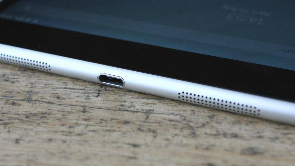
^ Say goodbye to your micro USB cables - the Nokia N1 comes with a reversible USB Type-C port
It's certainly one of the most attractive tablets I've seen, and its overall size strikes the perfect balance between big screen entertainment and portable practicality. It's great for holding in one hand if you want to read an eBook or surf the web, and it doesn't take up a huge amount of room in your bag if you want to use it out and about.
Launch Event
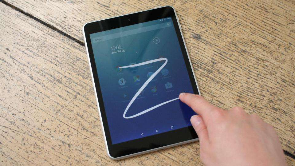
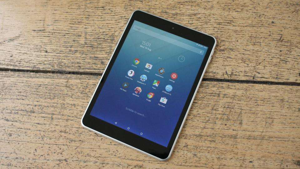
The Nokia N1 is no mere iPad Mini clone, though, as its Nokia Z Launcher gives Android 5.0.2 a real breath of fresh air. Instead of having traditional home screens, the Z Launcher presents you with a grid of your 12 most-used apps on a single home page. To launch other apps not included in this list, all you need to do is start scribbling a letter or two onscreen with your finger, and the N1 will then display everything that matches it, including apps, contacts, bookmarks and suggested web searches.

^ To search for apps, all you need to do is draw a letter onscreen
For instance, draw the letter "S" and the grid will display apps for the Google Play Store, Settings, Google Settings and Voice Search followed by other games, apps and contacts starting or containing that particular letter. It recognises both upper and lower case letters with ease, and the chunky white lines left behind by your finger provide excellent visual feedback on what you've just written. It also displays your letters as typed text above the grid to give you an even clearer picture of what it's searching for.
You can add more letters to get more specific results, but with 12 search results displayed, I almost always found exactly what I was looking for with just one letter. However, write too many in quick succession and the tablet will likely confuse your scribbles for another letter altogether. Still, it only takes around a second for it to recognise each letter, so you hardly have to wait long before you can write out another one. Alternatively, swipe in from the left hand side of the screen to view all your apps in alphabetical order.
^ The N1 comes with Nokia's Z Launcher by default (left), but you can always switch back to stock Android (right) in the Settings menu
Either way, it's an extremely simple and intuitive way to use and navigate Android, and it really helps the N1 stand out from other Android-based tablets. It takes a little getting used to, but like the current phone version of Z Launcher (which is still in beta at the moment), the tablet will gradually learn which apps you like to use at different times of the day and automatically promote them to the main home screen so you don't have to search for them. It's a small touch, but one that makes the tablet feel that much smarter and more practical. However, you can always switch back to the stock Android launcher in the Settings menu if you prefer.

