
Apple still dominates the tablet market with the iPad 2 , which uses a 9.7in display, and the vast majority of premium Android tablets have followed suit, with most devices having screen sizes around 10in.
Smaller tablets, except for bargain basement models, have been thin on the ground since Google launched its tablet-specific Android 3.0 (Honeycomb) operating system - which is soon to be replaced by the phone-and-tablet unifying Android 4.0 (Ice Cream Sandwich). This scarcity meant we were keen to get our hands on this more compact 8.2in Media Edition of the Motorola Xoom 2 .
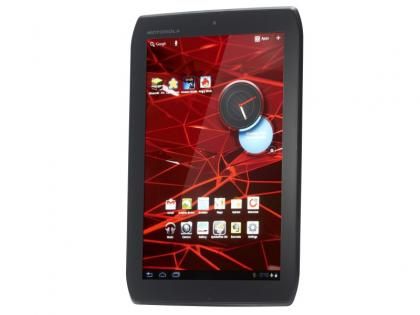
Motorola's design suggests that the Media Edition will be mainly used in portrait mode
Now 8.2in may not sound like a lot less than the 10.1 display on the standard Xoom 2, but diagonal screen measurements aren’t terribly useful when it comes to direct comparisons. The useful tool at http://www.silisoftware.com/tools/screen.php tells us that the screen is only 66% of the size of its larger sibling, or other similarly specified tablet. Despite being smaller, it certainly equals the Xoom 2 in image quality, with a bright and colourful IPS panel that will bring you only joy. It even has the same 1,280x800 resolution packed into the display.
Obviously the smaller size screen means smaller dimensions overall, after all the point of such a tablet is that it’s easy to tout about. At just below 9mm in depth it’s practically-speaking as thin as larger rivals and with a fairly slender bezel its dimensions of 140x216mm mean you can slip it into a big coat pocket - which it won’t weigh down thanks to its 388g weight - or most handbags.
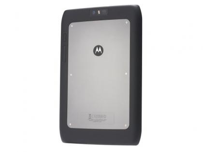
We like its sturdy feel and slightly techy appearance
Not that it appears designed for the fairer sex, with its distinctively macho styling echoing the Motorola RAZR , which comes to a head in the exposed bolts on the rear panel. It feels as tough as it looks, and with Motorola’s clever Splash-Guard technology and an edgeless Gorilla Glass front panel, it should survive a few mishaps.
Based on the placement of the camera, manufacturer’s logo and buttons, Motorola must feel that its smaller tablet is more likely to be used in portrait; compared to the landscape design of the larger Xoom 2 and other 10in Android tablet designs. We’re not sure about the logic of that, as to view webpages we used the Media Edition in landscape, to make them readable without having to rescale the text and mess with the layout. The camera is identical to that on the Xoom 2 and so is as disappointing as most tablet efforts, bar that of the Asus Transformer Prime .