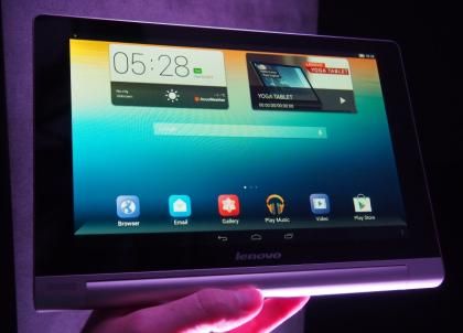
The Lenovo Yoga Tablet comes in both 10in and 8in sizes, a nod to Apple’s continued dominance with the iPad and iPad Mini. Though the prices are distinctly un-Apple like with the 10in version of this striking tablet costing just EUR299 and the smaller 8in at EUR229.

Despite that it makes us think of Sony – which is no bad thing. For starters its silver finish, logo and speaker grilles bring to mind an eighties style, when Sony ruled the electronics world. More importantly its off-balance design (at odds with its name) is reminiscent of the Sony Xperia Tablet S; with a slender body and thicker, circular section.

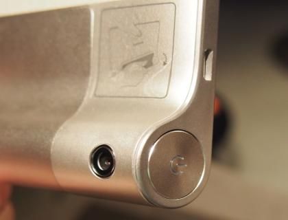
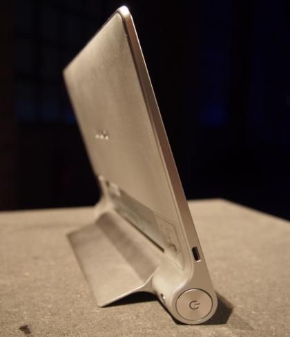
We liked the idea then and we like it now, plus Lenovo has made improvements. Handheld in portrait mode the bulge makes it far more ergonomic and the weight distribution towards that side helps too. Spin it round into portrait mode and you can use the bulge to angle the device more comfortably for game playing or typing.
KICKING BACK
However, its real party trick is the built-in kickstand. This flicks down from the back so you can stand the tablet upright to watch video content from the likes of Netflix or iPlayer, it will also come in handy when following a recipe in the kitchen, or other practical pursuits.

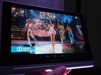
In portrait mode that bulge also means the Lenovo Yoga Tablet has space for forward-firing stereo speakers, something that more slender tablets can only dream of (and again the last time we saw it was on the Sony Xperia Tablet S). These alone make the audio more immediate, louder and clearer, it easily outclasses the competition in this respect. Furthermore, Lenovo has added Dolby Digital Plus software to get the best from them, with surround-style effects add space and depth to the audio.

Forward-firing stereo speakers and Dolby software make the Yoga a great-sounding tablet
Lenovo has thought it all through too, with a Sound and Vision addition to the settings pull-down menu. This lets you switch to the mode you’re using it in, which practically means switching around the stereo speakers and attempting to compensate (rather well) for the different colour reproduction you get when using a tablet in portrait mode.
The rest of the design is pretty amazing, though it isn’t all-metal as we first thought, instead being a canny blend of aluminium frame and plastic parts. Still, the micro-textured plastic rear panel looks classy and the whole thing is far better looking than the vast majority of Android tablets – in fact we’re struggling to think of any bar the Sony Xperia tablet Z.
DISPLAY
The Lenovo Yoga Tablet’s weak point is undoubtedly its display. We’ve become used to high-resolution displays of late, so it was a bit of a shocker to discover that both the 10in and 8in versions of the tablet use just 1,280x800 resolutions. Especially after the design screams high-end.
On the 10in tablet this is particularly troublesome, with obvious pixellation at just 150 pixels-per-inch. Colours are bright and vibrant, once you get away from the rather hideous looking default homescreen; and the viewing angles are superb. It’s not a device that will appeal to hardcore specification fans, but then we don’t think it’s been designed to – especially with the lady-friendly Ashton Kutcher heading up the advertising campaign.
The 8in tablet is another matter altogether though, here the lower resolution is far less of an issue, thanks to a much better-looking 189 pixels-per-inch. The sharper screen lifts the whole device, and makes it feel and look like a seriously attractive tablet.
SPECS
Inside, compromises have again been made to keep the price down. Both tablets use the MediaTek MT8125 quad-core 1.2GHz chipset, which is roughly on a par with the Nvidia Tegra 3 chipset we saw in the old Google Nexus 7, and identical to the one in the more recent Asus Memopad HD7 . It runs Android 4.2 smoothly, with a 1,360ms SunSpider score, though don’t expect blistering performance in the latest games.
The battery life is a claimed 18 hours on both devices, with 9,000mAh and 6,000mAh batteries in the 10in and 8in versions respectively. With batteries that big, and relatively modest hardware, we’ve no reason to doubt those figures at present.
ANDROID
Lenovo has taken the brave mode of messing with Android too. It has removed the app tray and gone with an iPad-style system where apps and their shortcuts are one and the same, delete the shortcut and you delete the app. It’s a more immediate way of managing software admittedly, but it’s likely to upset as many people as it attracts.
CONCLUSION
It’s a lot of tablet then and though the screen is a little disappointing on the 10in version we saw, the 8in version looks to be a huge contender in the smaller tablet space, with a bigger screen and more attractive design than Google’s technically superior Nexus 7 (2013). The odd way it deals with Android apps this is a tablet that won’t agree with everyone, however, but for those who aren’t too fussy about such things you get a beautifully designed device at a very reasonable price.
