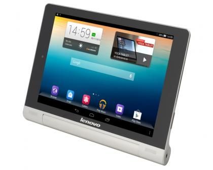
Lenovo's new tablet comes in both 10in and 8in screen sizes, a nod to Apple’s continued dominance with the iPad and iPad Mini. Though the 10in version looks good, it’s this more-compact Lenovo Yoga Tablet 8 that really grabbed our attention. A low price of just £199 makes it a rival for the Google Nexus 7 (2013) , though as you’ll see it’s more of an alternative than a direct competitor.

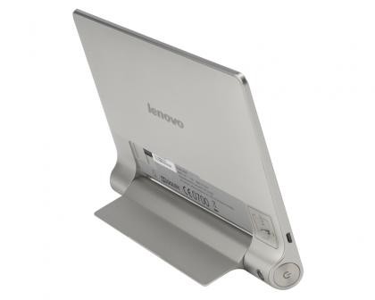
The Yoga Tablet makes us think of Sony for a number of reasons – which is no bad thing. For starters its shiny silver finish, logo and speaker grilles look distinctly retro, eighties styling, when Sony ruled the electronics world. More importantly, its off-kilter design (at odds with its name) is reminiscent of the Sony Xperia Tablet S ; most of it measures just 7.3mm thick, but a circular end section bulges out to 21.5mm.
Hold it in portrait mode, and the bulge makes it more comfortable to grip than most tablets. Having the weight distributed to one side helps too – not that the 400g of this 8in version is going to tire your arm out quickly. Spin it round into landscape mode and you can use the bulge to angle the device a little for playing games or typing.
KICKING BACK
The Yoga Tablet’s real party trick is the built-in kickstand. This flicks down from the back so you can stand the tablet upright to watch video content from the likes of Netflix or iPlayer, it will also come in handy when following a recipe in the kitchen, or other more hands-on activities such as bicycle maintenance.

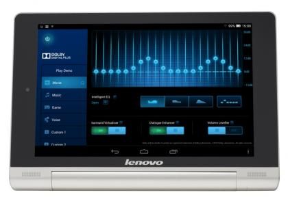
In landscape mode that bulge also means the Lenovo Yoga Tablet has space for forward-firing stereo speakers, something that more slender tablets can only dream of (and again the last time we saw it was on the Sony Xperia Tablet S). These make the audio more immediate, louder and clearer, than the competition. Furthermore, Lenovo has added Dolby Digital Plus software to get the best from them, with surround-style effects adding space and depth to the audio.

The rest of the design is pretty amazing given the low price. We really like the start button, as it's big, easy to find and has plenty of travel, so there's no fussing about trying to find a tiny switch that barely registers you pushing it.
The Yoga Tablet 8 isn't, as we first thought, instead being a canny blend of aluminium frame and plastic parts. Still, the micro-textured plastic rear panel looks classy and the whole thing is far better looking than the vast majority of Android tablets – in fact we’re struggling to think of anything that’s clearly smarter-looking.
DISPLAY
The Lenovo Yoga Tablet’s weak point is undoubtedly its display. We’ve become used to high-resolution displays of late, so it was a bit of a shocker to discover that both the 10in and 8in versions of the tablet use just 1,280x800 resolutions. Especially given that the design screams high-end.
On this 8in version, the limited resolution isn’t such a problem thankfully. The smaller screen means you get a respectable 189 pixels-per-inch, compared to just 150 on the 10in version. The sharper screen lifts the whole device, and makes it feel and look like a seriously attractive tablet. The screen may be small by 10in standards but with an 8in diagonal it’s actually 30 per cent bigger than the Nexus 7’s display, which puts clear ground between them, and between it and the ever-growing crop of super-sized smartphones.
Colours are bright and vibrant, once you get away from the rather hideous looking default home screen, and the viewing angles are superb. It’s not a device that will appeal to those upgrading who are looking for something clearly superior specification, but it’s unlikely to upset anyone thinking of buying their first tablet.
